PPT VISUALIZATIONS
This first part of the script visualizes the graphics shown in the Presentation.
################################## #
# ggplot2 script                   #
################################## #

# PRELIMINARIES ----
# clear work space
rm(list = ls())

# libraries
library(tidyverse)           # load in tidyverse

# set ggplot2 theme
theme_set(theme_linedraw(12))

# data
diamonds = diamonds          # diamonds data frame
penguins = penguins

# PLOTS FOR POWERPOINT ----
# no geoms ----
diamonds %>%
  ggplot(aes(x = price))
ggsave(plot = last_plot(),
       filename = "./Figures/aesthetics.png")

# geom_histogram ----
diamonds %>%
  ggplot(aes(x = price)) +
  geom_histogram()
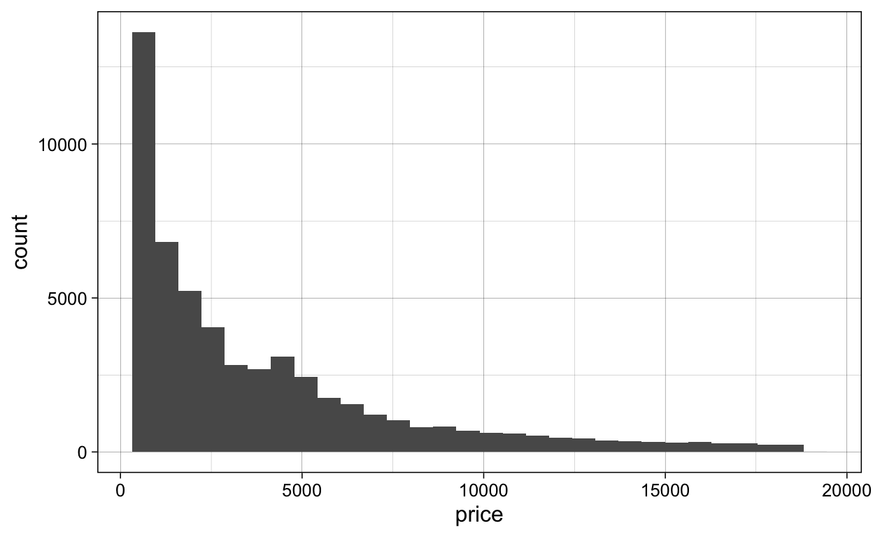
ggsave(plot = last_plot(),
       filename = "./Figures/geom_histogram.png")

# geom_density ----
diamonds %>%
  ggplot(aes(x = price)) +
  geom_density()

ggsave(plot = last_plot(),
       filename = "./Figures/geom_density.png")

# geom_freqpoly ----
diamonds %>%
  ggplot(aes(x = x)) +
  geom_freqpoly()
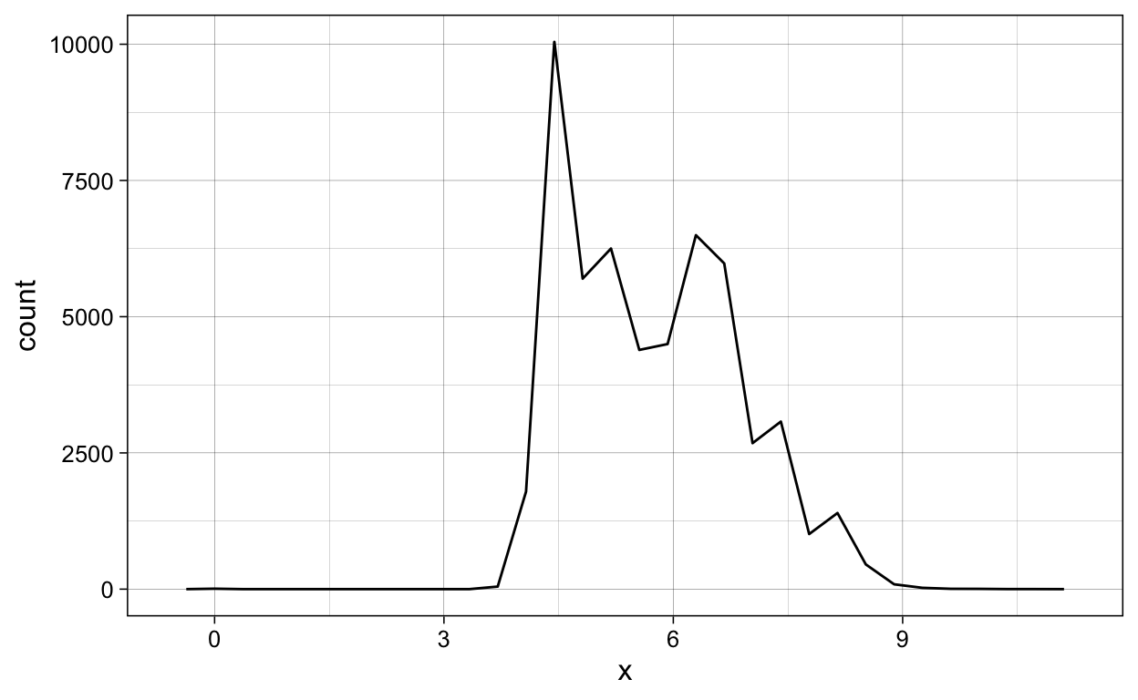
ggsave(plot = last_plot(),
       filename = "./Figures/geom_freqpoly.png")

# geom_bar ----
diamonds %>%
  ggplot(aes(x = color)) +
  geom_bar()

ggsave(plot = last_plot(),
       filename = "./Figures/geom_bar.png")

# geom_point ----
penguins %>%
  ggplot(aes(x = bill_length_mm,
             y = bill_depth_mm)) +
  geom_point()
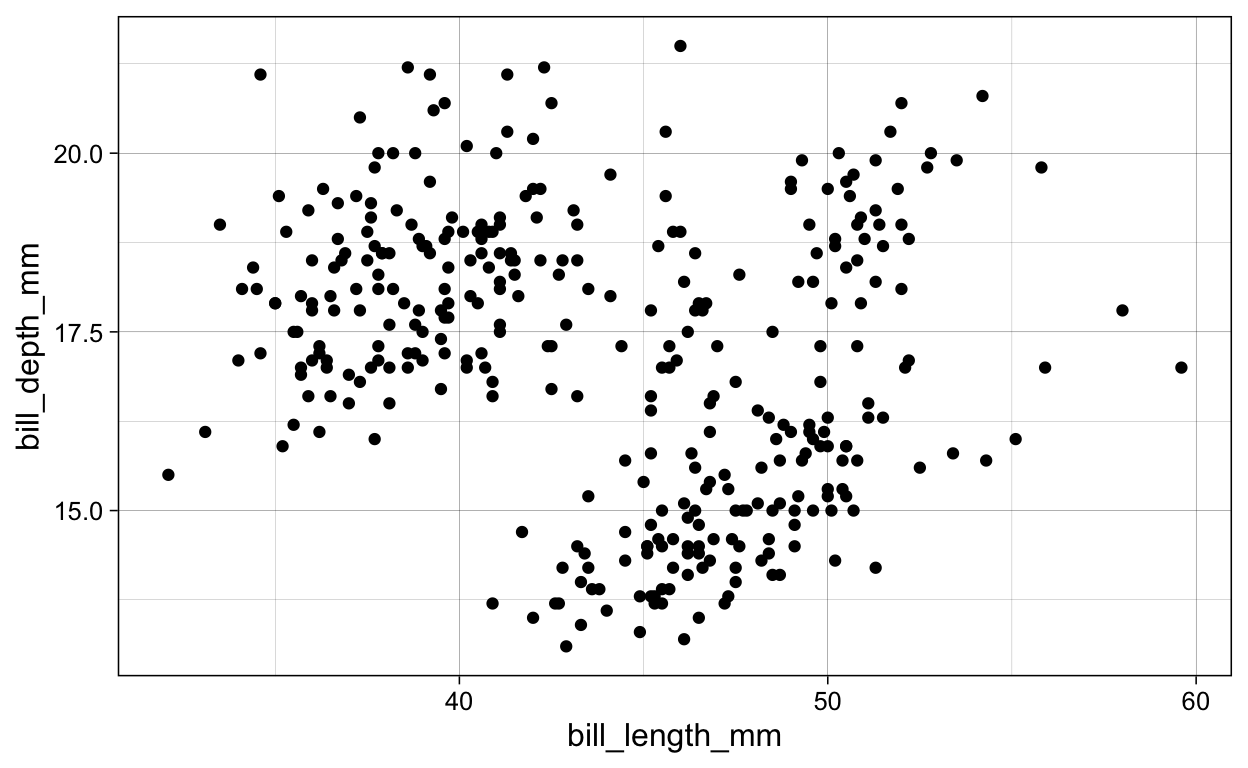
ggsave(plot = last_plot(),
       filename = "./Figures/geom_point.png")

# geom_jitter ----
diamonds %>%
  ggplot(aes(x = price,
             y = carat)) +
  geom_jitter()

# geom_smooth ----
penguins %>%
  ggplot(aes(x = bill_length_mm,
             y = bill_depth_mm)) +
  geom_smooth()

ggsave(plot = last_plot(),
       filename = "./Figures/geom_smooth_gam.png")

penguins %>%
  ggplot(aes(x = bill_length_mm,
             y = bill_depth_mm)) +
  geom_smooth(method = "lm")

ggsave(plot = last_plot(),
       filename = "./Figures/geom_smooth_lm.png")

# geom_boxplot ----
diamonds %>%
  ggplot(aes(x = cut,
             y = carat)) +
  geom_boxplot()
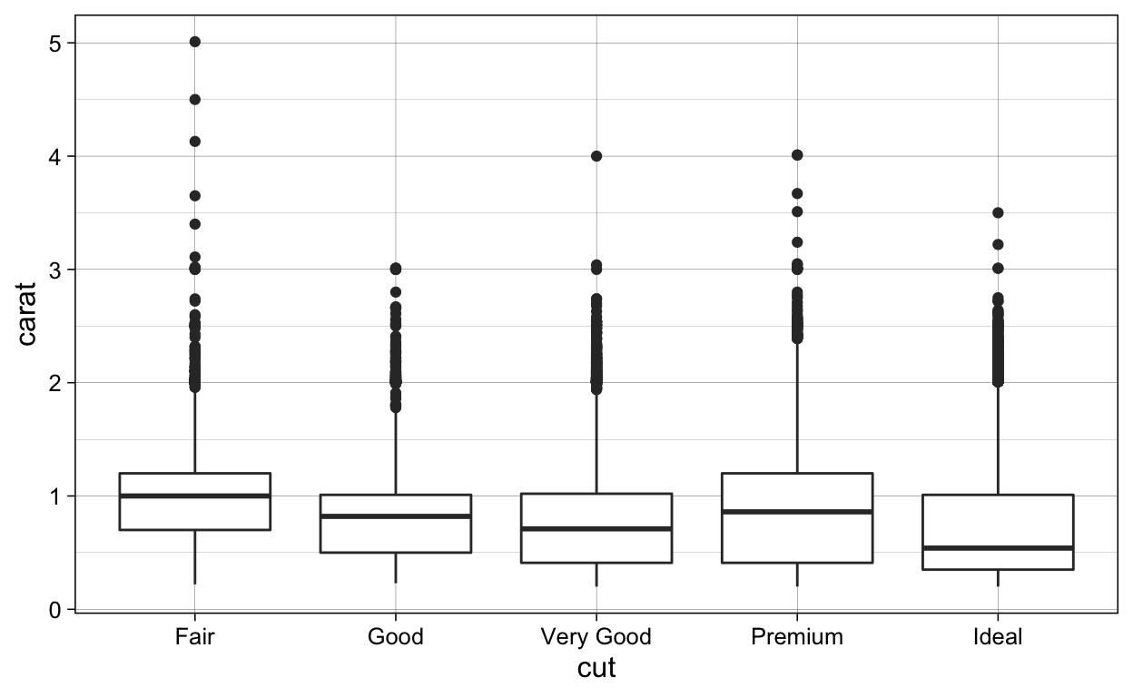
ggsave(plot = last_plot(),
       filename = "./Figures/geom_boxplot.png")

# geom_barplot_identity ----
diamonds %>%
  ggplot(aes(x = cut,
             y = carat)) +
  geom_bar(stat = "identity")
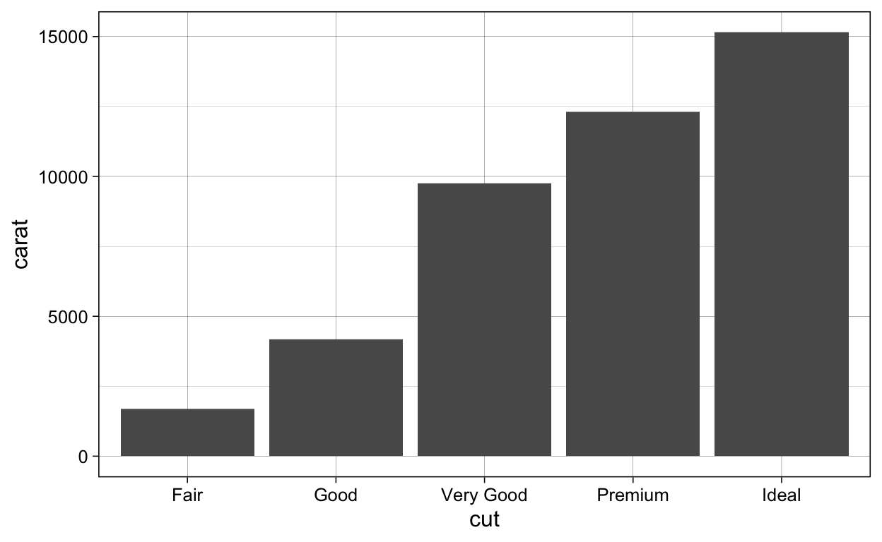
ggsave(plot = last_plot(),
       filename = "./Figures/geom_barplot_identity.png")

# geom_violiny ----
diamonds %>%
  ggplot(aes(x = cut,
             y = carat)) +
  geom_violin()

ggsave(plot = last_plot(),
filename = "./Figures/geom_violin.png")
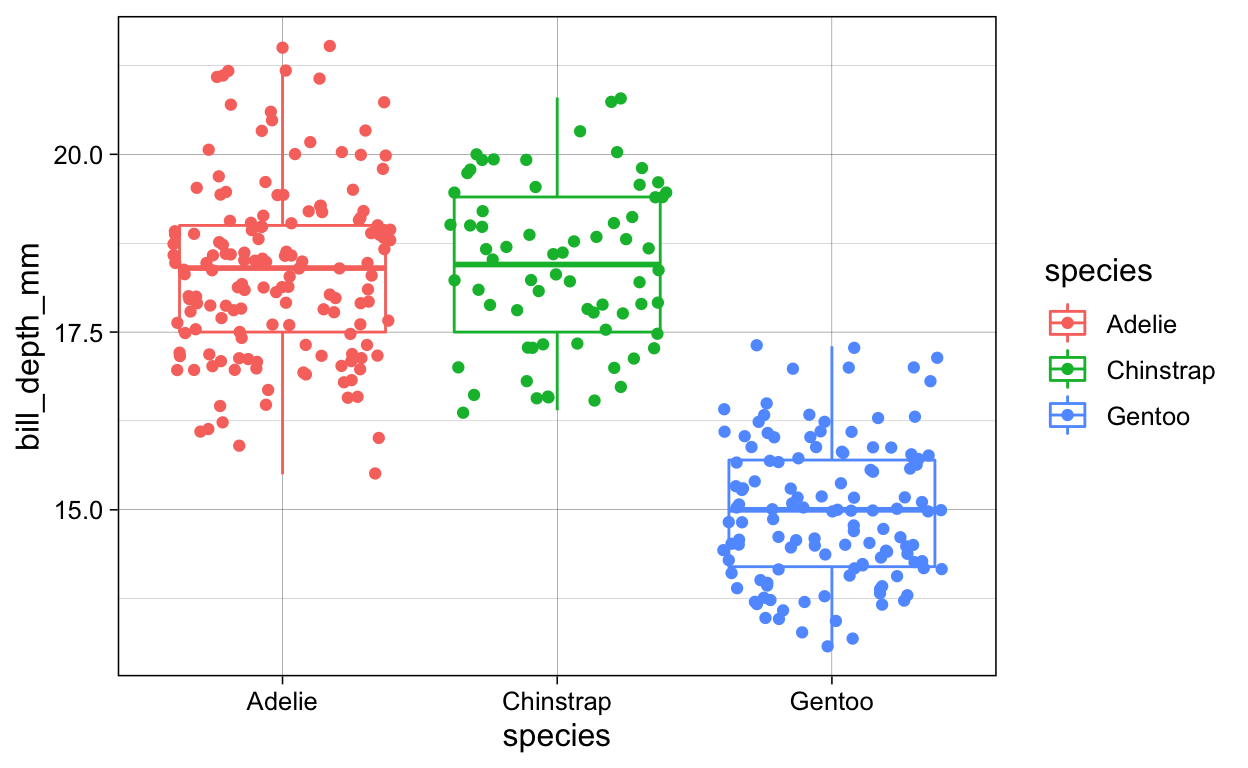
# geom_point_aesthetics
penguins %>%
ggplot(aes(x = bill_length_mm,
y = bill_depth_mm,
color = species)) +
geom_point()

ggsave(plot = last_plot(),
       filename = "./Figures/geom_point_aesthetics1.png")

penguins %>%
  ggplot(aes(x = bill_length_mm,
             y = bill_depth_mm,
             color = species,
             shape = species)) +
  geom_point()

ggsave(plot = last_plot(),
       filename = "./Figures/geom_point_aesthetics2.png")

# geom_point + geom_smooth
penguins %>%
  ggplot(aes(x = bill_length_mm,
             y = bill_depth_mm,
             color = species)) +
  geom_point() +
  geom_smooth()

ggsave(plot = last_plot(),
       filename = "./Figures/geom_point_geom_smooth.png")

# geom_point + geom_smooth + geom_smooth_linear
penguins %>%
  ggplot(aes(x = bill_length_mm,
             y = bill_depth_mm,
             color = species)) +
  geom_point() +
  geom_smooth() +
  geom_smooth(method = "lm",
              color = "black")
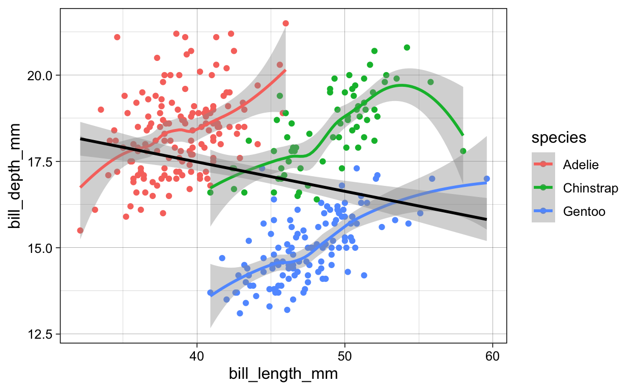
ggsave(plot = last_plot(),
       filename = "./Figures/geom_point_geom_smooth_geom_smooth_linear.png")

# geom_jitter + geom_smooth + color_species
penguins %>%
  ggplot(aes(x = species,
             y = bill_depth_mm,
             color = species)) +
  geom_boxplot() +
  geom_jitter()
ggsave(plot = last_plot(),
       filename = "./Figures/boxplot_jitter_color.png")

# geom_jitter + geom_smooth + fill_species
penguins %>%
  ggplot(aes(x = species,
             y = bill_depth_mm)) +
  geom_boxplot(aes(fill = species)) +
  geom_jitter()
ggsave(plot = last_plot(),
filename = "./Figures/boxplot_jitter_fill.png")
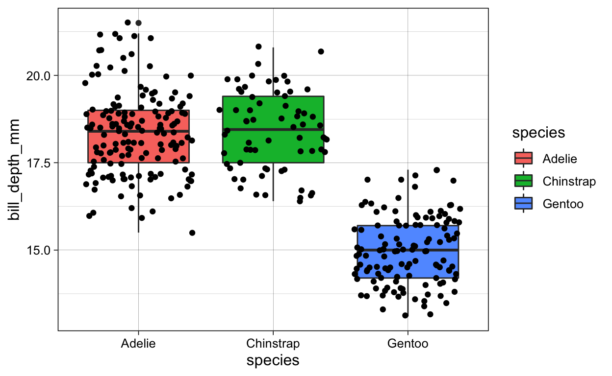
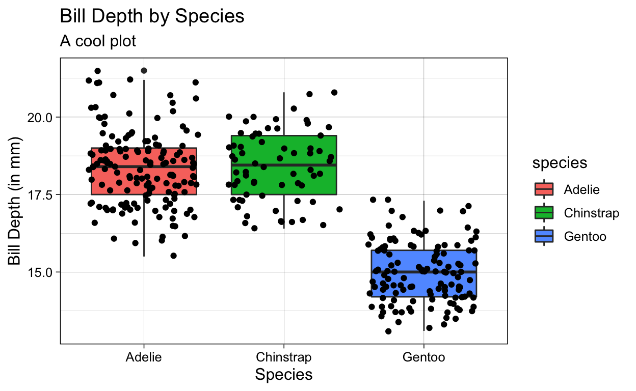
# geom_jitter + geom_smooth + fill_species + labs
penguins %>%
ggplot(aes(x = species,
y = bill_depth_mm)) +
geom_boxplot(aes(fill = species)) +
geom_jitter() +
labs(x = "Species",
y = "Bill Depth (in mm)",
title = "Bill Depth by Species",
subtitle = "A cool plot")
EXTRA VISUALIZATIONS
GAMMs
The following script shows several different visualization techniques for (a) generalized additive mixed effects models, using the newest packages in the business; and (b) Bayesian mixed effects models, using some tips and tricks I’ve assembled during my own statistical analyses.
Let’s get started!
Check out Stefano’s tidymv package for the difference smooths: https://stefanocoretta.github.io/tidymv/articles/plot-smooths.html
And see Simpson’s gratia package for plotting marginal effects plots of the GAM(M) outputs: https://gavinsimpson.github.io/gratia/ When loading in the gratia package, it will install some new dependency packages, so it might end up updating some older package versions that you have. Simpon’s updates for factor smooths aren’t available from CRAN yet, so if you ever need to plot factor smooths from a non-Guassian model, you will need to load in the gratia package directly from github.
This can be done with the following code:
remotes::install_github("gavinsimpson/gratia")
In the case that you install the Github version, make sure to install updates dependency structures as well
Happy plotting! :)
# PRELIMINARIES ----
# clean workplace
rm(list = ls())

# libraries
if (!require("pacman")) install.packages("pacman")
pacman::p_load(
  tidyverse,        # data manipulation
  mgcv,             # compute (and simulate) GAM(M)s
  gratia,           # plot partial effect plots of GAM(M)s using ggplot2
  tidymv            # plot difference smooths of GAM(M)s using ggplot2
)

# set ggplot theme
theme_set(theme_minimal(12))
SIMULATE DATA
Simulate the data for a GAMM. These data include:
- a
by =factor (fac) - random effects (four groups; i.e. a–d)
The model includes
- Nonlinear effect for the variable x2 with different trajectories for variable
fac - factor smooths with different trajectories for variable
fac
# Simulate GAM data with factor smooths
# simulate GAM data with a by factor
data = gamSim(4, 400) %>%

  # simulate random effects structure
  mutate(rand = rep(letters[1:4],
                    each = 100),
         rand = as.factor(rand))
Factor `by' variable exampleRUN MODEL
# nonlinear x2 with diff trajectories for variable `fac`
mod = gam(y ~ s(x2, by = fac) +

            # factor smooths with diff trajectories for for variable `fac`
            s(x2, rand, by = fac, bs = "fs", m = 1),

          # simulated data
          data = data)
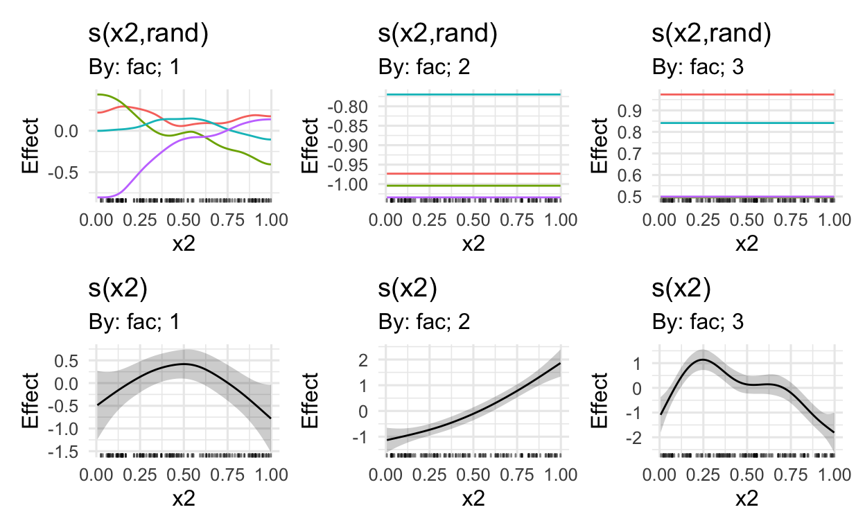
MARGINAL EFFECTS
Using the draw() function in Simpson’s gratia package, we can plot the marginal effects
# get marginal effects (also random effects)
draw(mod)
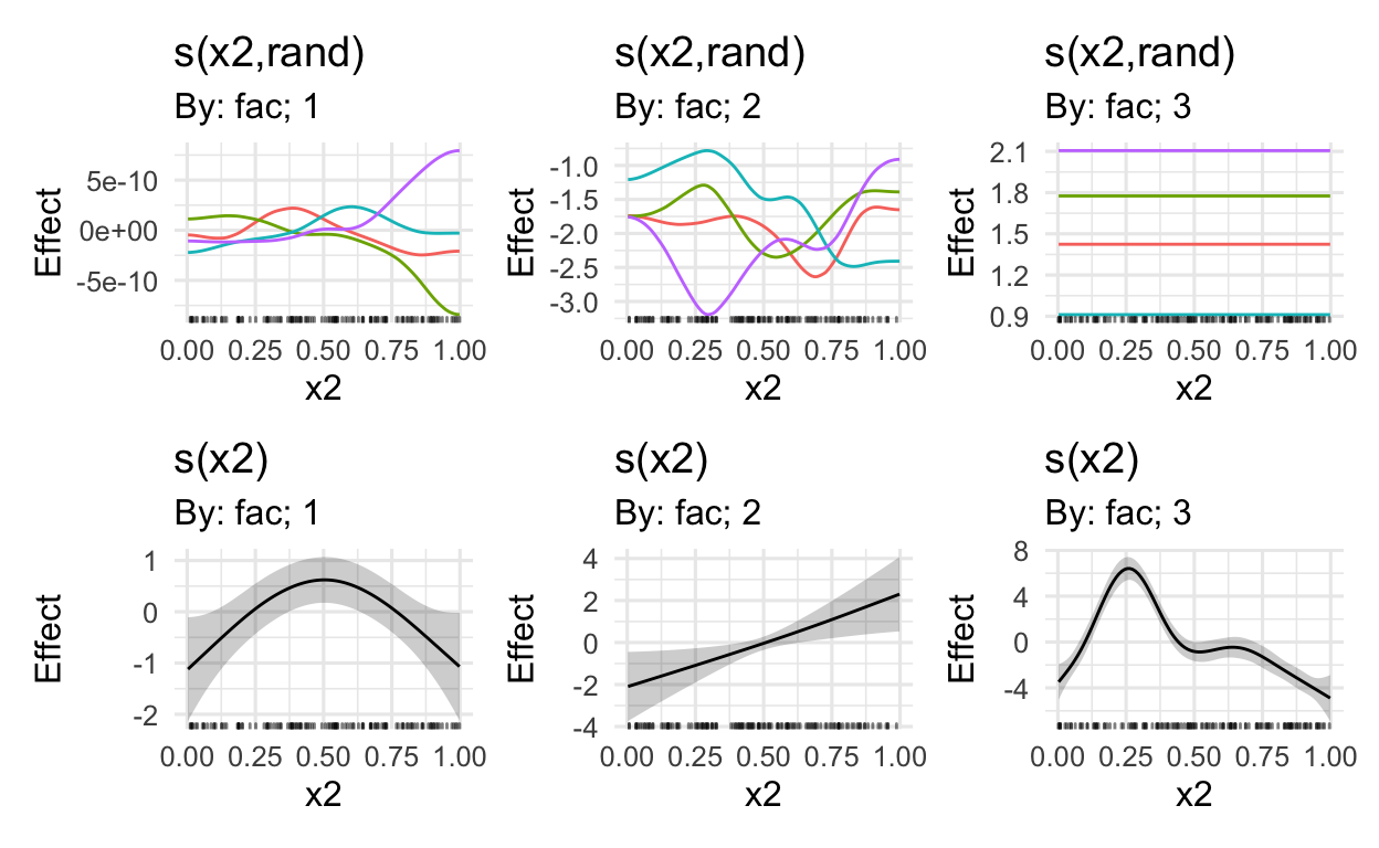
# only plot the first three marginal effects
# i.e. this excludes the random effects from the viz
draw(mod,
     select = c(1:3))
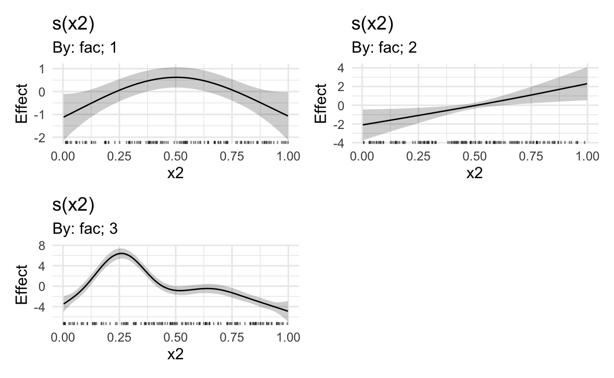
# see ?draw.gam for more options
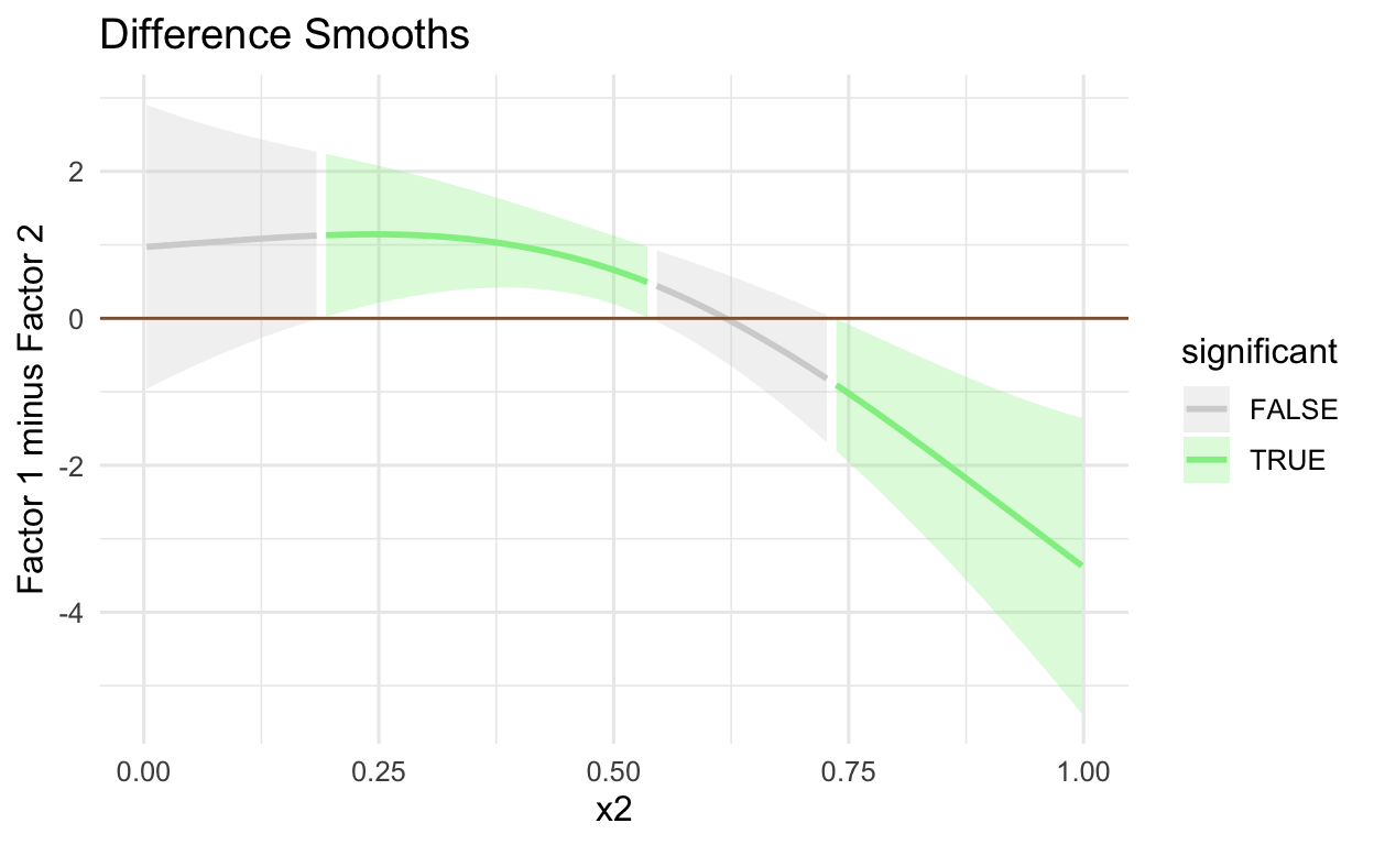
DIFFERENCE SMOOTHS
Using the get_smooths_difference() from the tidymv package, we conduct a visual significance test to see whether/when the CIs of the factors 1 and 2 are different
# get the differences between factors 1 and 2
get_smooths_difference(mod,
                       x2,
                       list(fac = c("1", "2"))) %>%

  # plot variable of interest (y and x axes)
  # and group variable specified in the get_smooths_difference()
  ggplot(aes(x = x2,
             y = difference,
             group = group)) +

  # plot the ribbon with the lower and upper CIs
  # and whether the difference between CIs
  # is significant or not
  geom_ribbon(aes(ymin = CI_lower,
                  ymax = CI_upper,
                  fill = sig_diff),
              alpha = 0.3) +

  # determine color based on whether upper/lower CIs are diff
  geom_line(aes(colour = sig_diff), size = 1) +

  # lightgrey when sig_diff is FALSE, green when TRUE
  scale_colour_manual(values =
                        c("lightgrey", "lightgreen")) +
  scale_fill_manual(values =
                      c("lightgrey", "lightgreen")) +

  # place line at zero
  geom_hline(aes(yintercept = 0),
             colour = "#8f5f3f") +
  labs(colour = "significant", fill = "significant") +
  labs(x = "x2",
       y = "Factor 1 minus Factor 2",
       title = "Difference Smooths") +
  theme(legend.position = "right")
SIMULATE DATA: PLOTTING ON THE RESPONSE SCALE
If we were, to say, run a model with a non-Gaussian distribution, we oftentimes want to plot the effects on the response scale. So, let’s say, we compute a mixed-effects model and we want to use a beta distribution (because my values are bound between 0 and 1). The following code shows how we could simulate such data.
# Simulate GAM data with factor smooths
# simulate GAM data with a by factor
data_beta = gamSim(4, 400) %>%

  # simulate random effects structure
  mutate(rand = rep(letters[1:4],
                    each = 100),
         rand = as.factor(rand)) %>%

  # a really bad way to get values
  # between 0 and 1
  mutate(y = plogis(y))
Factor `by' variable exampleRUN MODEL
# nonlinear x2 with diff trajectories for variable `fac`
mod_beta = gam(y ~ s(x2, by = fac) +

            # factor smooths with diff trajectories for for variable `fac`
            s(x2, rand, by = fac, bs = "fs", m = 1),

            # add beta distribution
            family = betar(link='logit'),

            # simulated data
            data = data_beta)
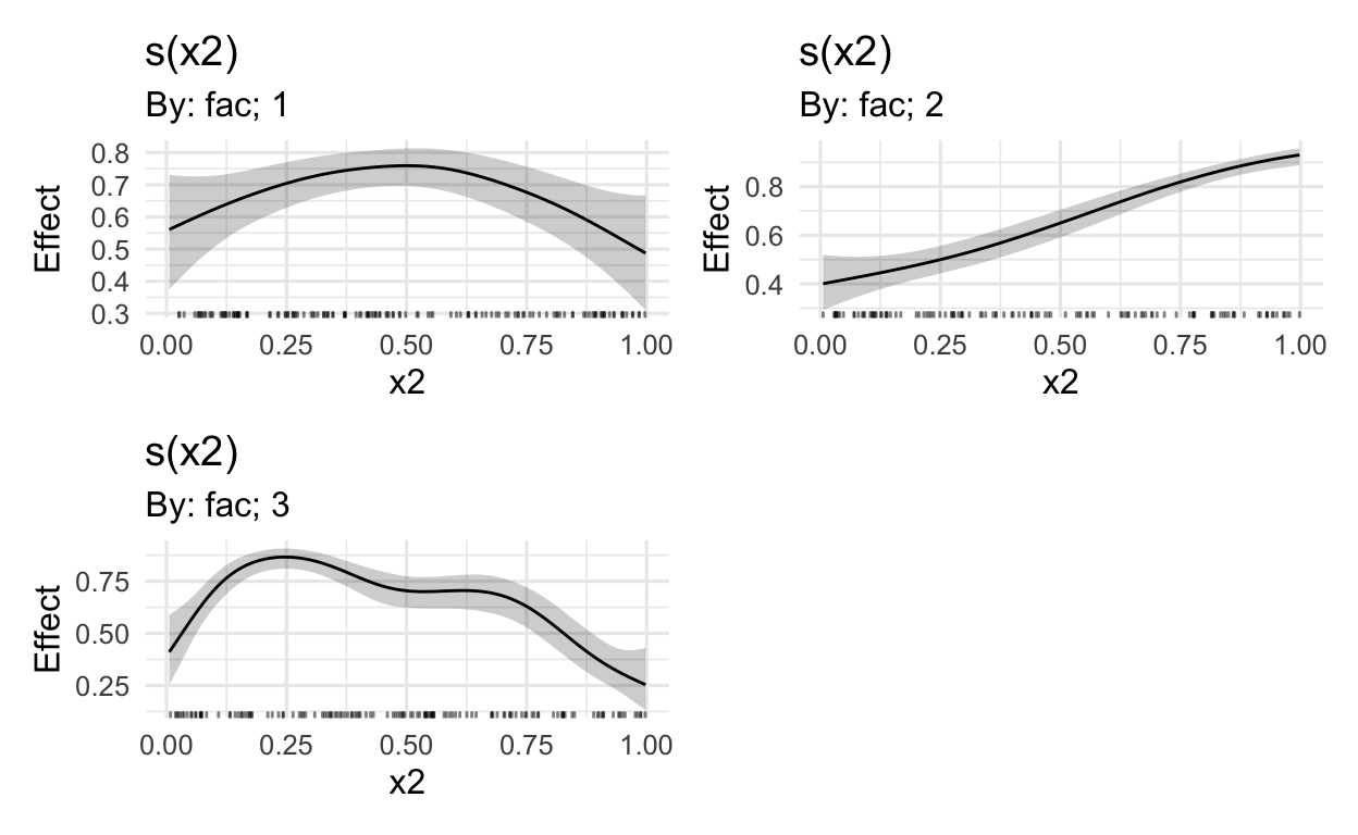
MARGINAL EFFECTS
But of course, now we want to plot this data using the draw() function in Simpson’s gratia package.
# plot on the log-odds scale
draw(mod_beta)
# plot on the log-odds scale
# without random effects
draw(mod_beta,
     select = c(1:3))

draw(mod_beta,

     # the beta distribution is mapped onto the
     # log odds space using the logit linking function
     # the logistic function plogis reverses this
     fun = plogis,

     # add the intercept value to all model outputs,
     # before the transformation (fun)
     constant = (coef(mod_beta)[1]),

     # select only the relevant smooths
     # i.e. excluding random effects
     select = c(1,2,3))
BAYESIAN MIXED-EFFECTS MODELS
Here, we see a few cool visualization techniques for displaying the results of Bayesian mixed-effects models.
# PRELIMINARIES ----
# clean workplace
rm(list = ls())

# libraries
if (!require("pacman")) install.packages("pacman")
pacman::p_load(
  tidyverse,            # data manipulation
  brms,                 # Bayesian model
  marginaleffects,      # plot regression models
  ggdist,               # plotting
  tidybayes,            # plot posterior draws
  modelr,               # data_grid function
  ggridges,             # ridge plots
  ggmcmc                # posterior data frame (long format)
)

# set ggplot theme
theme_set(theme_minimal(12))
DATA MANIPULATION
Load in data from my dissertation. The data used here are from my PhD, namely L2 socio-indexical interpretations of standard German and Austrian dialect.
# READ IN DATA
# I'm using a full path here (DON'T DO THIS IN REAL LIFE)
# because I'm drawing data from another working directory
# the good ol' fashioned "do as I say, not as I do"
# how I am reading the data here is really nasty
df_rating = full_join(read_csv("~/Documents/R/R Projects/DYNSC/Data/Data sets/rating.csv"),
                      read_csv("~/Documents/R/R Projects/DYNSC/Data/Data sets/exposure.csv"),
                      by = "id") %>%

  # z-score: EXPOSURE
  mutate(
    englishExposure = scale(englishExposure),
    standardExposure = scale(standardExposure),
    dialectExposure = scale(dialectExposure)
    )


# DATA MANIPULATION

# FRIENDLY DF function ----
friendlyModFun = function(df_rating){

  # get friendly rating data ready for model
  friendlyRating = df_rating %>%

    # choose only friendly ratings
    filter(grepl("Friendly", indexChar)) %>%

    # transform data to between 0-1
    mutate(rating = rating / 100) %>%

    # make any 1s .999 and any 0s .0001
    mutate(rating = ifelse(rating == 1, .999, rating),
           rating = ifelse(rating == 0, .0001, rating))

  return(friendlyRating)

}
RUN MODEL
# rating formula
formula = rating ~ englishExposure*variety +
  standardExposure*dialectExposure*variety +
  (standardExposure + dialectExposure | id) + (0 + occupation | id)

# create friendly data frame
friendlyRating = friendlyModFun(df_rating)

# run friendly model
# I'm also just using flat priors;
# wouldn't do that in real life either
modFriendly = brm(formula,
                  data = friendlyRating,
                  family = Beta())
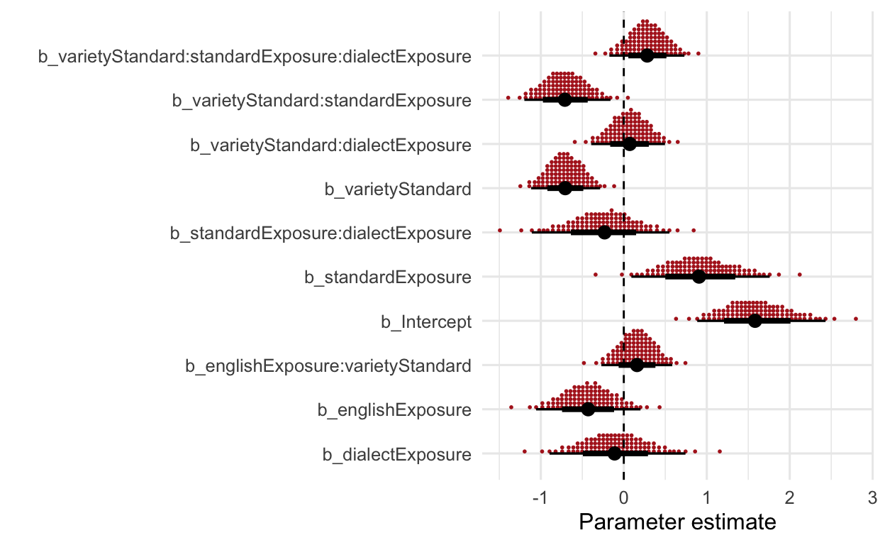
PLOT THE EFFECTS
Quantile dotplot
“The posterior distribution is visualized here in the form of quantile dotplots. A major advantage in Bayesian inference is to quantify our uncertainty revolving around any given effect, and quantile dotplots allow for frequency-based visualizations from which probabilities can easily be extract (Fernandes et al., 2018; Kay et al., 2016). The idea is to represent the posterior distribution not as one canonical point or interval, but as 100 equally likely points. As such, each point of a given distribution represents 1%, so if there are 7 points stacked on top of each other, then the likelihood of this value is 7%. Similarly, if we are interested in the likelihood of a interval between two values, we can count the dots in the respective interval to receive the probability. Note that the estimates are reported an the log odds scale, since the primary goal of this model visualization and the following model summary is to show the directionality of the respective effects […].” (Wirtz, under review)
ggs(modFriendly) %>%
  filter(grepl("b_", Parameter)) %>%
  ggplot(aes(x = value,
             y = Parameter)) +
  stat_dotsinterval(quantiles = 100,
                    slab_colour = "firebrick",
                    slab_fill = "firebrick",
                    .width = c(.70, .95)) +
  geom_vline(xintercept = 0, linetype = "dashed") +
  labs(y = "") +
  scale_fill_manual(values = c("firebrick", "skyblue")) +
  labs(x = "Parameter estimate",
       y = "")
Another possibility would be to use slab intervals, like in the following plot:
ggs(modFriendly) %>%
  filter(grepl("b_", Parameter)) %>%
  ggplot(aes(x = value,
             y = Parameter)) +
  stat_interval() +
  stat_pointinterval(.width = c(.66, .95),
                     position = position_nudge(y = -0.3)) +
  scale_color_brewer() +
  geom_vline(xintercept = 0, linetype = "dashed") +
  labs(y = "") +
  labs(x = "Parameter estimate",
       y = "")

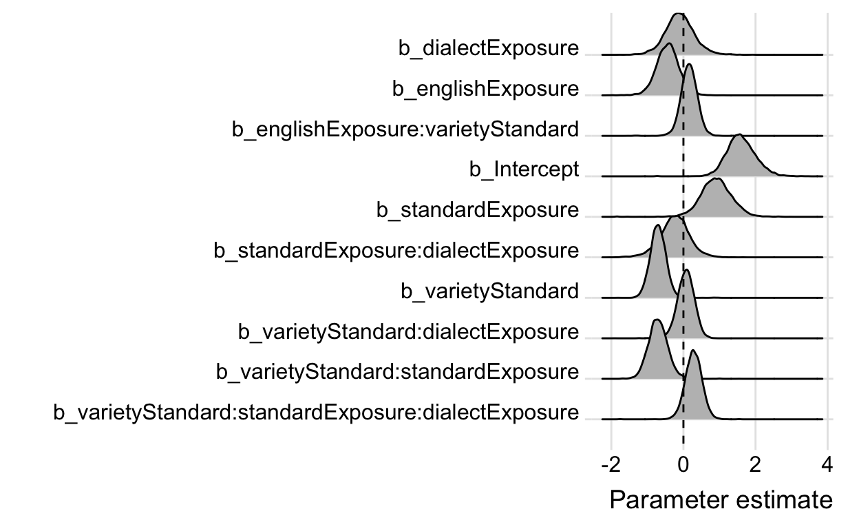
I’m also quite the fan of ridge plots, which can be plotted using the ggridges package.
ggs(modFriendly) %>%
  filter(grepl("b_", Parameter)) %>%
  ggplot(aes(x = value,
             y = Parameter)) +
  geom_density_ridges(fill = "grey") +
  geom_vline(xintercept = 0, linetype = "dashed") +
  labs(x = "Parameter estimate",
       y = "") +
  scale_y_discrete(limits = rev) +
  theme_ridges()
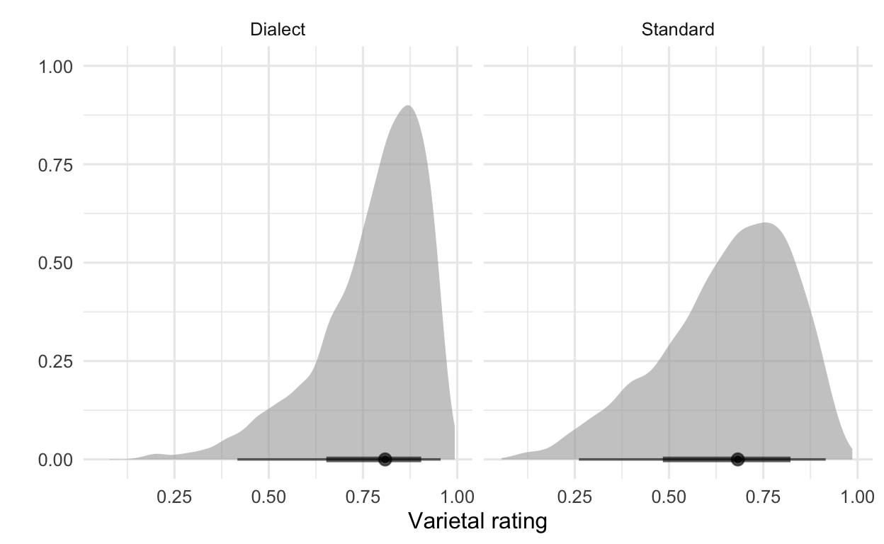
If, for example, we would like to plot the differences between standard vs. dialect ratings, we could do this using the marginaleffects package and drawing on the posterior distribution.
# friendly model: Standard vs. dialect ratings
marginaleffects::predictions(modFriendly,
                             newdata = datagrid(variety = c("Dialect", "Standard"))) %>%
  posteriordraws() %>%
  ggplot(aes(x = draw)) +        # to change colors of plots use fill = variety
  stat_halfeye(alpha = .6) +
  facet_wrap(~ variety) +
  labs(x = "Varietal rating",
       y = "") +
  theme(legend.position = "none")
The brms package also offers the conditional_effects() function, which allows us to plot conditional effects quick and dirty. To modify the plot, you can get the drawn upon posterior distribution in the conditional_effects() function and revamp the plot a bit.
conditional_effects(modFriendly,
                    effects = "standardExposure:variety",
                    ndraws = 2000)[[1]] %>%
  ggplot(aes(x = effect1__,
             y = estimate__)) +
  geom_ribbon(aes(ymin = lower__,
                  ymax = upper__),
              alpha = .3) +
  geom_line(size = .8) +
  facet_wrap(~ effect2__) +
  labs(x = "Standard German Exposure",
       y = "Friendliness rating",
       title = "Friendliness ratings:",
       subtitle = "Model predictions") +
  theme(legend.position = "none")
