For (later) reference, you can find here a list of common geom_ functions
Exercise 1
Run the following code chunk
# libraries
if (!require("pacman")) install.packages("pacman")
pacman::p_load(
  tidyverse,                                     # data manipulation
  palmerpenguins                                 # package containing data frame to plot
)

theme_set(theme_bw(12))                          # set ggplot2 theme

iris = iris                                      # load in iris data frame
Vampires = read_csv("./Data/Vampires.csv")       # load in Vampires data frame
Exercise 1.1
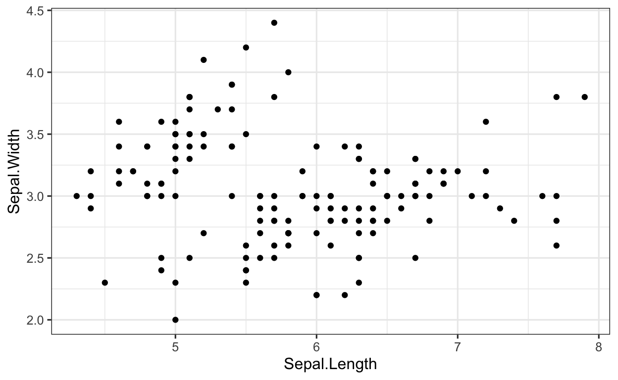
The data frame iris contains the two variables Sepal.Length and Sepal.Width. Both variables are continuous, meaning we can make a scatter plot to show the relationship between the two variables. Using Sepal.Length as the x and Sepal.Width as the y, plot these two variables using a scatter plot.
HINT You will need the function geom_point().
Click for Answer
SOLUTION
When plotting with ggplot2, we first have to define which data frame contains the two variables. In this case, this is the data frame iris.
iris %>%                                     # data
  ggplot(aes(x = Sepal.Length,               # set x value
             y = Sepal.Width)) +             # set y value
  geom_point()                               # apply geom_point() function
Exercise 1.2
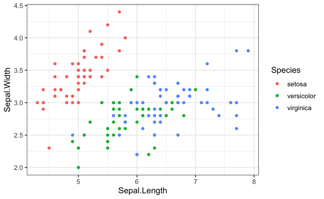
ggplot2 is extremely flexible, and we can plot just about everything we can imagine (and then some). The data frame iris also contains the variable Species (which are the 3 species of iris, namely setosa, versicolor and virginica). Let’s say we would like to focus on finding a plotting method to classify the species. To do this, we could simply color-code the data points according to which species they belong to.
Building off the code from the previous code chunk, color-code the variables according to which species (variable: Species) they belong to.
HINT Remember, when we want to assign colors (i.e. AESTHETICS) to a geom, we do this via the mapping function (i.e. the aes() function).
Click for Answer
SOLUTION
Building off the code we have already written, we can assign the colors using the color argument in the aes() function.
iris %>%                                        # data
  ggplot(aes(x = Sepal.Length,                  # set x value
             y = Sepal.Width)) +                # set y value
  geom_point(aes(color = Species))              # aesthetics: separate colors for SPECIES
Note, play with the color of the plots, see this document.
Exercise 1.3
Using the labs() function, change the x axis of the plot to read “Sepal Length”, the y axis to read “Sepal Width” and the title to read “Iris Scatterplot”.
Click for Answer
SOLUTION
Using the labs() function is very intuitive, all we need to do is add the labs() function and specify the x, y and title arguments. REMEMBER when specifying these, the labs need to be in parentheses!

Exercise 1.4
Using the ggsave() function, save this plot as “scatterplotIris” using a RELATIVE PATH to the folder Figures. Save the plot as a .png file.
HINT REMEMBER, we have to save our final plot as an object before saving it! To specify the relative path, you will need the file = argument, i.e. ggplot(OBJECT, file = “./Figure/scatterplotIris.png”)
Click for Answer
SOLUTION
To save a plot, we first need to save this as an object, which the directions specified as “scatterplotIris”. So, we first save the plot using the = operator.
scatterplotIris =                           # define object
  iris %>%                                  # data
  ggplot(aes(x = Sepal.Length,              # set x value
             y = Sepal.Width)) +            # set y value
  geom_point(aes(color = Species))          # aesthetics: separate colors for SPECIES

# save object to FIGURES folder and name object boxplotPenguine.png
ggsave(scatterplotIris, file = "./Figures/boxplotPenguine.png")
Exercise 2
Before beginning with the following exercises, run the following code:
Exercise 2.1
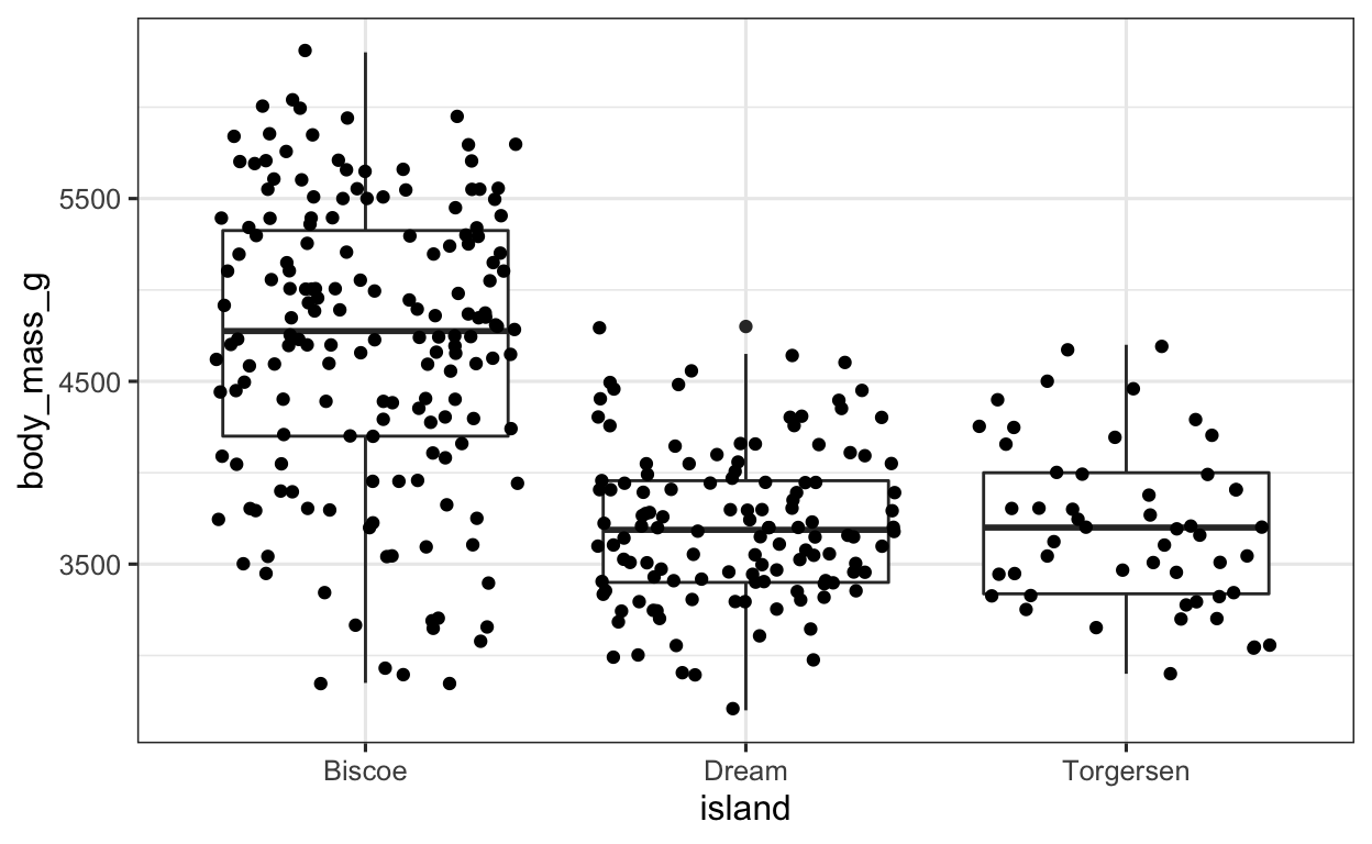
Take a look at the penguins data frame (using either view(penguins) or simple penguins). Let us say we are interested in the extent to which the body mass of the penguins (variable: body_mass_g) differs between islands (variable: islands). We would like to plot this using a boxplot.
If we were to plot this in base R, the plot would look like the following:
# RUN this code to see what the plot looks like in base R
# you do not need to do anything with the code other than run it
boxplot(penguins$body_mass_g ~ penguins$island)
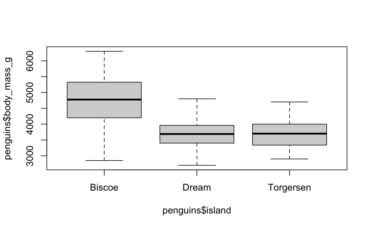
What is the x variable? What is the y variable? What do we need to enter into our ggplot to recreate this base R plot using ggplot2?
HINT You will need the geom geom_boxplot
Click for Answer
SOLUTION
As always, we specify our data frame, which in this case is penguins. After that, we need to specify our aesthetics arguments, i.e. the x and y arguments. Since we want to divide the boxplot up by islands, this has to be our x argument, since the x axis shows the different groups (i.e. different islands). The y axis on the other hand shows the body mass of the penguins. After we have defined our aesthetics arguments, we can then simply tell ggplot to plot a boxplot by specifying geom_boxplot(). Easy, right?!
penguins %>%                            # data
  ggplot(aes(x = island,                # x value
             y = body_mass_g)) +        # y value
  geom_boxplot()                        # apply the BOXPLOT geom
Exercise 2.2
Alright, so we have now plotted a boxplot. This is great, but boxplots are not necessarily always the best way to visualize data, because the distribution of the groups are not shown. A boxplot only displays the median, and the data’s quartiles. This isn’t always helpful, so we often want to somehow show the distribution of our data. We can very easily do this in ggplot by simply adding the individual data points.
To display the individual data points, we can add the geom geom_jitter (which is similar to geom_point(), the only difference being the dots are spread out a little more). Add geom_jitter() to the ggplot code from exercise 2.1.
Click for Answer
SOLUTION
The great thing about ggplot is that we can stack geoms on top of each other, adding layers to our plot. This makes it very simple to create informative plots.
To add the individual data points, we can simply add the geom_point() function to the plot we have already created.
penguins %>%                               # data
  ggplot(aes(x = island,                   # set x value
             y = body_mass_g)) +           # set y value
  geom_boxplot() +                         # apply BOXPLOT geom
  geom_jitter()                            # apply JITTER geom (scattered data points)
Exercise 2.3
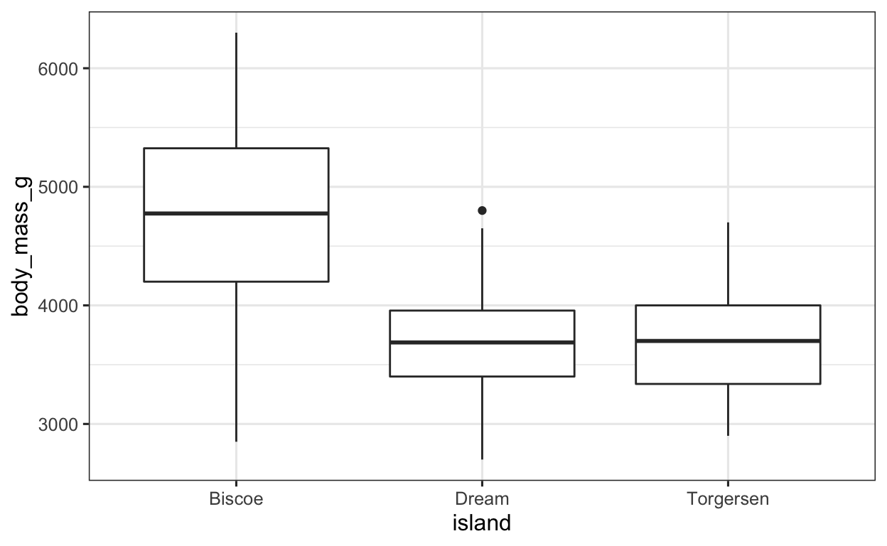
Now, let’s say that we would like to color code the islands, so that each island on the boxplot has a different color. How could we do this?
HINT Remember, if we want to specify the ASTHETICS (such as color), we need the aes() function, and in this case we would like to FILL the boxplots with color.
Click for Answer
SOLUTION
Since we want to define some type of aesthetic, we need the aes() function. We can EITHER define this in the aes() function in the ggplot() function, or in the geom_boxplot() function (doesn’t make any difference either way). Since we want to fill the boxplots according to the island, we have to specify the fill argument in the aes() function, as seen below.
penguins %>%                              # data
  ggplot(aes(x = island,                  # set x value
             y = body_mass_g)) +          # set y value
  geom_boxplot(aes(fill = island)) +      # apply BOXPLOT geom; sep. colors for ISLAND
  geom_jitter()                           # apply JITTER geom (scattered data points)

Exercise 2.4
Using the ggsave() function, save this plot as “boxplotPenguine” using a RELATIVE PATH to the folder Figures.
HINT REMEMBER, we have to save our final plot as an object before saving it! To specify the relative path, you will need the file = argument. Don’t forget the NAME the plot in the file argument!
Click for Answer
SOLUTION
To save a plot, we first need to save this as an object, which the directions specified as “boxplotPenguine”. So, we first save the plot using the = operator.
boxplotPenguine =                           # define object
  penguins %>%                              # data
  ggplot(aes(x = island,                    # set x value
             y = body_mass_g)) +            # set y value
  geom_boxplot(aes(fill = island)) +        # apply BOXPLOT geom; sep. colors for ISLAND
  geom_jitter()                             # apply JITTER geom (scattered data points)

# save boxplotPenguine object in FIGURES folder and named boxplotPenguine.pdf
ggsave(boxplotPenguine, file = "./Figures/boxplotPenguine.pdf")
Exercise 3
Especially when we are first having a look at our data, and when we then want to somehow plot our descriptive statistics (e.g. gender, age etc.), many are tempted to use barplots. Barplots, however, are relatively uninformative, and can oftentimes be misleading. In the words of McElreath (2015: 203)
Barplots suck. […] The only problem with barplots is that they have bars. The bars carry only a little information—which way to zero, usually—but greatly clutter the presentation and generate optical illusions.
It’s therefore better to use other visualization methods such as dotplots, density plots, violin plots, eye or half-eye plots. These types of plots are extremely easy to make in R (even easier than barplots).
Exercise 3.1
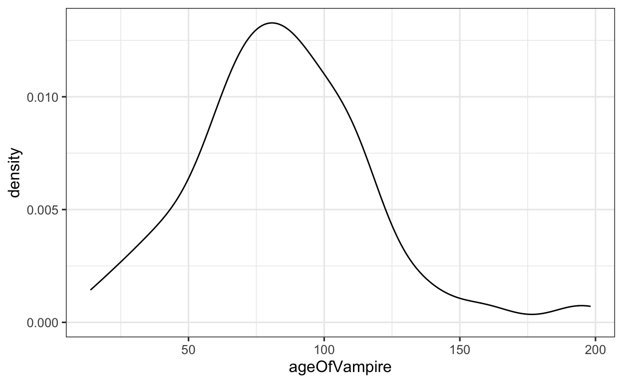
Let’s take our Vampires data frame. We would like to visualize the data distribution of age (variable: ageOfVampire) in our group using a density plot (geom_density()). When plotting a density plot, the aes() function only takes an x = argument.
Click for Answer
SOLUTION
When visualizing a density plot, we as always need to define which data frame our variable(s) are saved in. In this case, this is the Vampires data frame. We then use the pipe and begin with the ggplot() function. We then need to define our x = argument in the aes() function. After, we simply apply the geom_density() function.
Vampires %>%                            # data
  ggplot(aes(x = ageOfVampire)) +       # set x value
  geom_density()                        # apply DENSITY geom
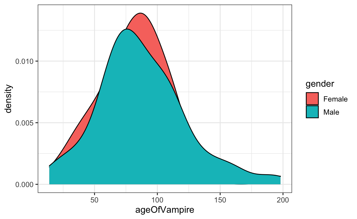
Example 3.2
Alright, now let’s say we would like to display the age distribution according to the gender of the vampires. To do this, we can apply the fill argument to the aes() function, and instructing ggplot to plot the ageOfVampire variable, filling the density plots by gender.
Apply the variable gender to the fill argument in the aes() function.
Click for Answer
SOLUTION
Now, to plot the density plots according to gender, all we need to do is apply the fill argument to the aes() function.
Vampires %>%                              # data
  ggplot(aes(x = ageOfVampire,            # set x value
             fill = gender)) +            # fill density with colors by GENDER
  geom_density()                          # apply DENSITY geom
Exercise 3.3
But WAIT! The plots overlap and we can’t see them well. We have several options here—probably the easiest is that we can make the density plots ‘lighter’, so that we can see both plots and their distributions. We do this by applying the alpha argument to the respective geom.
Apply the alpha = .4 argument to the geom_density() function. After, play with changing the .4 to higher / lower (between 0 and 1) to see what this function does.
Click for Answer
SOLUTION
To make the density plots more transparent, we can apply the alpha argument and adjust the degree of transparency.
Vampires %>%                           # data
  ggplot(aes(x = ageOfVampire,         # set x value
             fill = gender)) +         # fill density with colors by GENDER
  geom_density(alpha = .4)             # apply DENSITY geom; transparency 40%

Exercise 4: The Ugly Plot
Here a list of common geom_ functions: Use this list to test out different geoms on the Vampires, Iris or Penguine data frames.
WHO CAN MAKE THE UGLIEST PLOT?!
Take 15-20 minutes and (either alone or in groups) attempt to make the absolut worst, ugliest, horribly looking and utterly vomit-worthy plot you can manage by stacking geoms on top of each other.
And don’t forget to test out different ggplot2 THEMES!!
Save this plot, USING A RELATIVE PATH, in the Figures folder as a .png file under the name uglyPlot_your initials.png
Send this to me via E-Mail (mason.wirtz@stud.sbg.ac.at) once you are finished.
Advanced: Visualizing GAMs using ggplot2
When working with any type of data, visual analysis should always be your first step. Before deciding on the distribution of a model, it is worth considering whether the nonlinearity of a predictor-outcome relationship is pronounced enough to justify using methods other than linear methods.
If you’re ever interested in using generalized additive models (GAMs), it is also entirely possible to visually diagnose whether the data you are dealing with are nonlinear enough to advocate/justify using GAMs.
Let’s say we are interested in visualizing the nonlinear effects of age of the vampires on the number of people a vampire has changed into vampires, with seperate smooths fitted to gender. We can diagnose whether a GAM is perhaps justified by plotting this using the geom_smooth function, specifying the method as “gam” and the formula as y as a function of the smooth term x. This shows us a relatively linear model, so we might think twice before using a complexer model such as a GAM or GAMM.
Vampires %>%                               # data
  ggplot(aes(x = numberChangedToVamp,      # set x value
             y = ageOfVampire)) +          # set y value
  geom_point() +                           # apply POINT geom (data points)
  geom_smooth(aes(color = gender,          # apply SMOOTH geom; sep. color for GENDER
                  fill = gender),          # fill color by GENDER
              method = "gam",              # smoothing method GAM
              formula = y ~ s(x)) +        # formula for smoothing function; nonlinear x
  scale_color_viridis_d("gender") +        # define color scheme
  scale_fill_viridis_d("gender")           # define color scheme

Let’s take a look at what would justify using a GAM:
if (!require("pacman")) install.packages("pacman")
pacman::p_load(
  mgcv,                               # GAMs
  gratia                              # plot GAM
)

set.seed(4444)                        # set seed for reproducability
dat = gamSim(4, n = 400)              # generate nonlinear data with factors
Factor `by' variable exampledat %>% # data
ggplot(aes(x = x2, # set x value
y = y)) + # set y value
geom_point() + # apply POINT geom (data points)
geom_smooth(aes(color = fac, # apply SMOOTH geom; color by FAC
fill = fac), # fill by FAC
method = "gam", # smoothing method GAM
formula = y ~ s(x)) + # formula for smoothing function; nonlinear x
scale_color_viridis_d("fac") + # define color scheme
scale_fill_viridis_d("fac") # define color scheme

We see very clear nonlinear trends. Let’s compare this to output after we have decided to run a GAM.
model =                       # define object
  bam(y ~ s(x2, by = fac),    # y as a nonlinear function of x2; sep. smooths for FAC
  data = dat                  # data argument
)

draw(model) &                 # plot effects, quick and dirty
  theme_bw()                  # change scheme
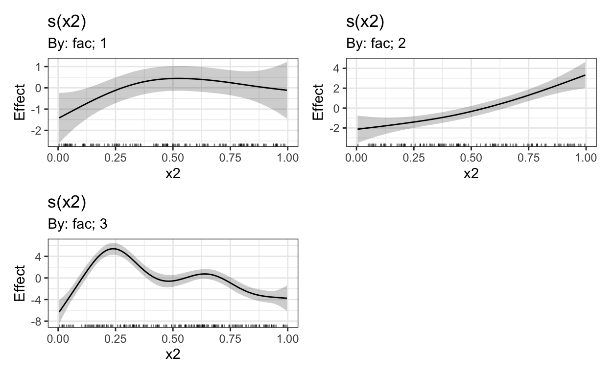
Given there are no extra random effects/factor smooths to be taken into account, this should provide us with the same smooths as shown above.